Designing a more client friendly ID card for our care company
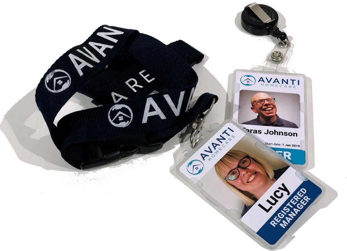
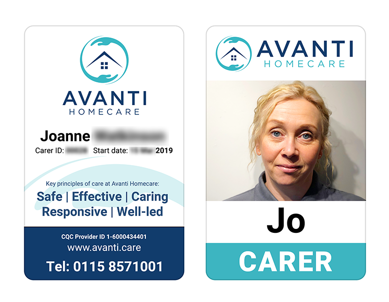
When we first started Avanti Homecare as a graphic designer I was tasked with designing the ID cards that our carers should use. I took a look around the web and had a think about it myself and came up with the following ID card that we issued to our staff on a retractable cord they could clip to their uniforms.
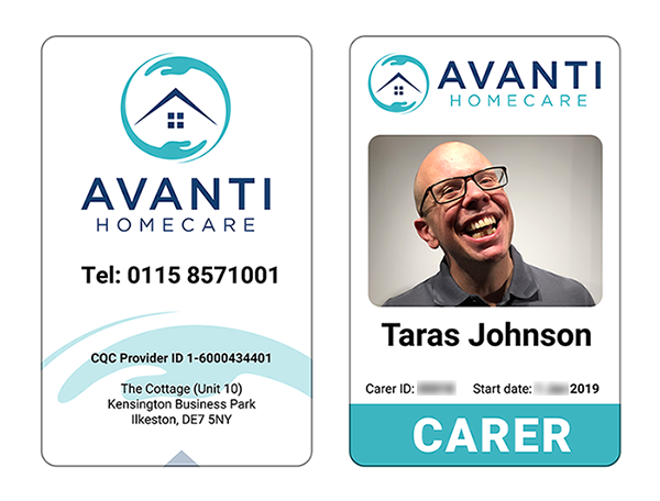
Above is my ID card design (yes that’s me). I went portrait as I thought the format better suited the information flow, on the front (right) we have all the elements you would expect:
- Company logo
- Photograph of holder
- Name of holder
- A big label “Carer” because we want to clearly identify what they do
- Some items to allow identity verification (ID and Start date).
In March 2019 Jo joined our team. Jo has a wealth of experience in care (not to mention her cupboard full of the qualifications!) and working with people with dementia.
Having been issued her badge on a retractable cord she immediately went out and bought herself a lanyard. So I asked her why. She told me that it was so that our clients (especially those with dementia) could easily see who she was. It reassured them.
I thought this was brilliant and ordered a set of lanyards (with the quick release points to prevent injury) for all of our staff.
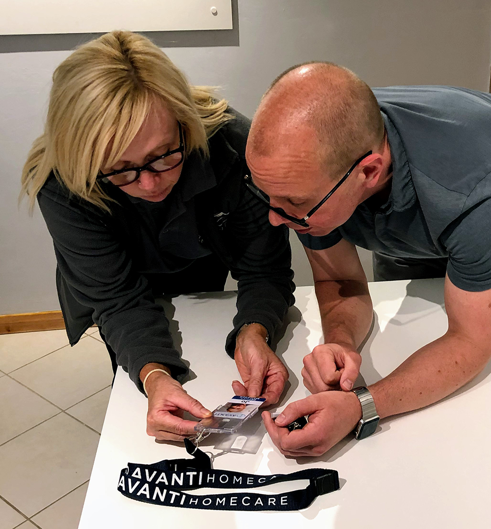
But then I got to thinking how we could change the design of the ID card to make the whole thing more assistive as a reassurance for our clients.
Why is the ID card design important?
Clients with dementia can sometimes forget who our carers are. This can happen between visits and also sometimes during the same visit. Imagine how that must feel for them to be in their own homes but with a stranger there. Who is this person? Why are they here?
If that stranger has a uniform and an ID card around their neck then everyone’s first instinct is to look to that card for information. It might be that a glance is enough to trigger memory. Sometimes even after reading all the information we still may not have any memory of who the person in front of us is. But, if the information on the ID card is clear and easy to read quickly it can give reassurance about why they are there and allow you to interact with that person by their name.
The ID card needs to deliver the essential information fast to older eyes, and as we all know eyesight can deteriorate with age.
ID card iteration 2
So we created version 2 of our badge which Jo took out on a field trial.
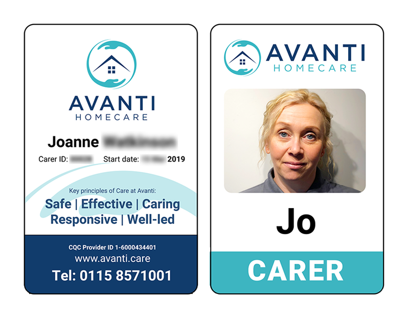
As you can see I moved the small (and probably unreadable to our clients) bits of verification info to the back, with the carer’s full name, and cut down on the text on the front to the minimum necessary (using shorter names), hoping our clients could just glance and pick out the essential stuff.
Simpler and clearer. Jo tested the new card with our clients and they found it easier to read and she had more people calling her by her name. But she also found they were trying to pick out her photo to make sure it’s her… enter version 3.
ID card iteration 3
Much as the graphic designer in me likes the sympathetic rounded corners on the photograph in this case usability is king. I removed my rounded corners and increased the photograph space (all the way to the edge).
The new version was approved by our clients, they found it much easier to see Jo’s picture and thus it made them feel more comfortable. Our best comment from testing was not even intended for Jo really,
one of the clients glanced at her ID and said “Oh yes, it’s you” to themselves. Reassured.
The card holder
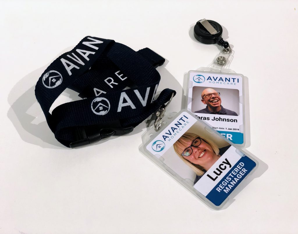
There was one other item we could improve. The ID cards come in a solid plastic holder, this was slightly milky so the text and image were not entirely clear. I ordered various different ID card holders and eventually settled on open faced (no plastic in front) as being the clearest.
This again was met with approval from our clients.
Design points for better care company ID card usability
The key design points for a more usable care company ID card design.
- Use a lanyard so that the ID is always visible.
- Use a very clear plastic card holder or an open faced one
- Use large bold fonts for better legibility
- Cut down the text on the front to make it easy to read it all fast
- Big photos so users can match the photo to the face.
- Put all the other important information on the back so that it is still available for anyone who needs it.
Big thanks to Jo who drove this entire innovation. We are always looking for ways we can improve things for our clients and our carers so we can provide the best quality care.


